
Wordmark
As a designer, I was fascinated by the notion of innovativeness of Gorham Silver and also the distinctive marks embedded on the bottom of the silverware. Also wanted to design wordmark that was playful since one of the main goal of the exhibition was to educate the children. Therefore I decided to use Brown to highlight the innovative and playful feel and Big Caslon to highlight the elegance of the silver.

Three Versions of Backlist posters
Back List Poster Mockup
Back List Posters
Three different versions to highlight the details of Gorham Silver and the marks.

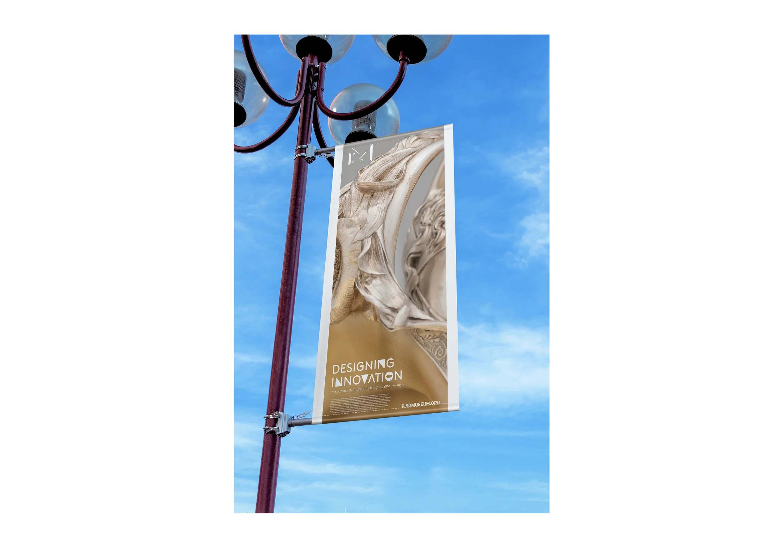
Billboards
Billboards designed to be placed on the highway exit to the RISD Museum
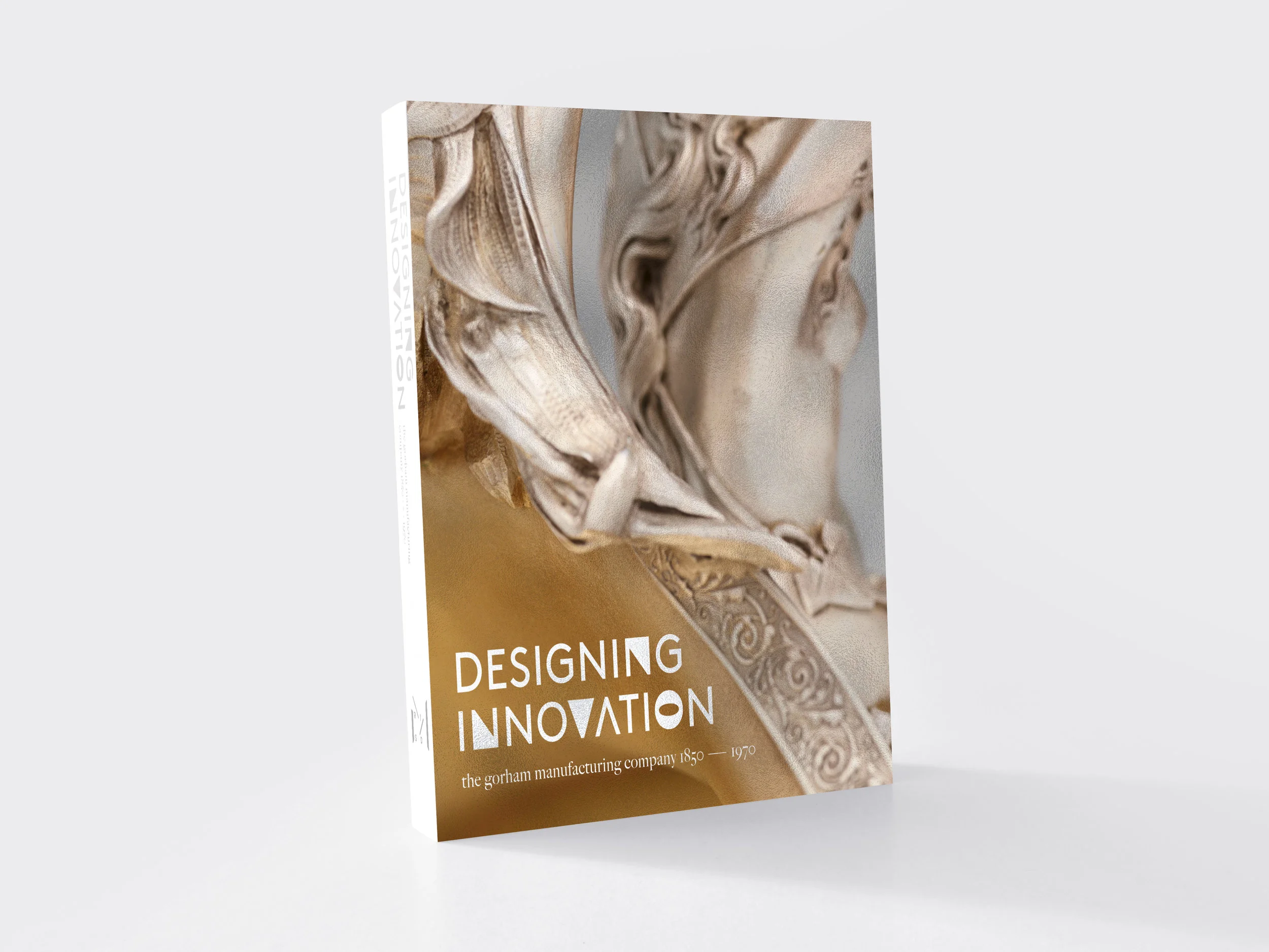
Front Cover of the Book

Book Cover
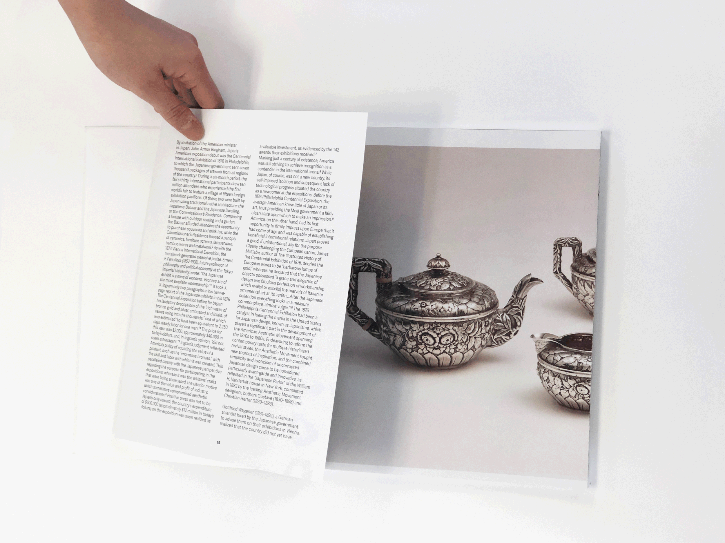
Book Design
Designed to highlight to different details of Gorham Silver Pieces. The spread opens up to reveal the marks of the bottom of the Gorham Silver pieces.
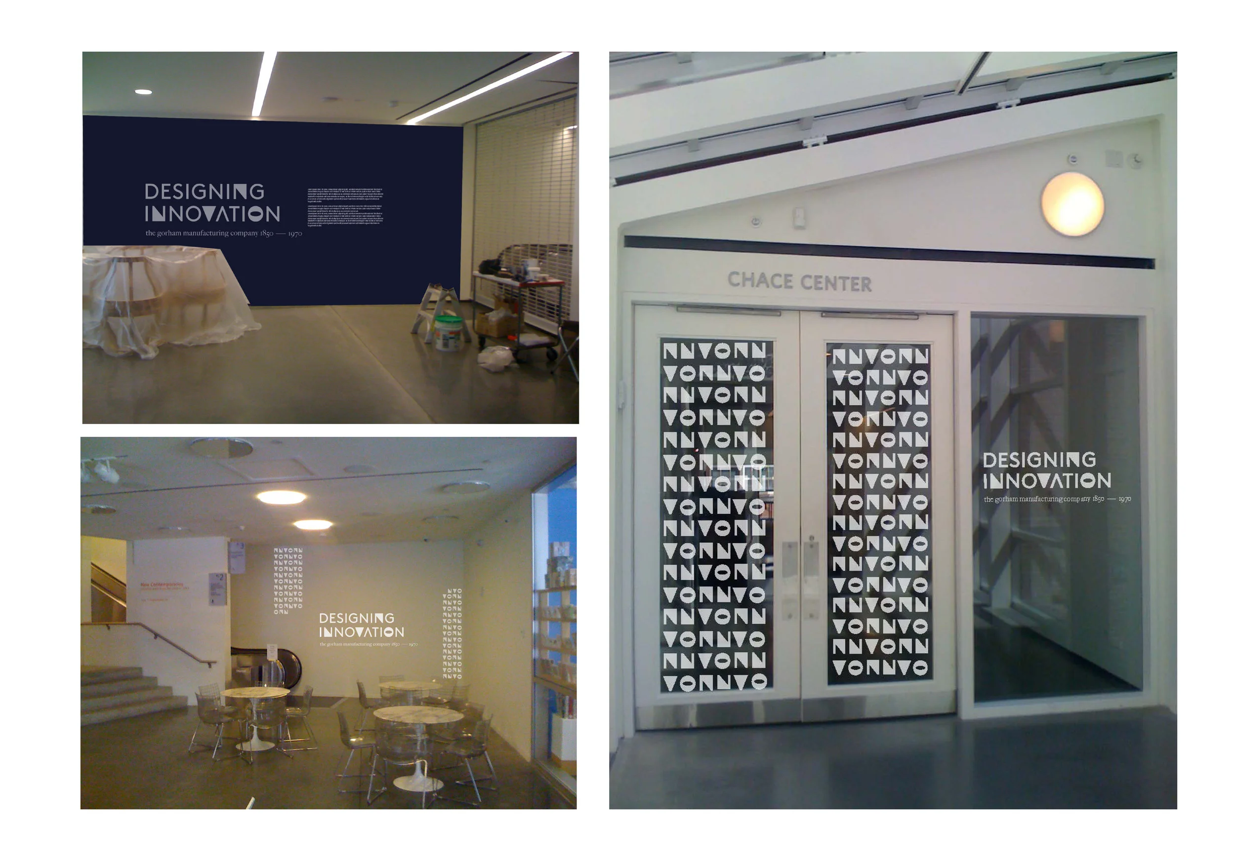
Wall Installation
These are how the work will be presented on the walls at RISD Mueseum.